I have access to the “new look” now. It changed… nothing in the app. It’s just the icon and a couple of other very small components (like the transfer between accounts isn’t a small starling logo now, it’s just an S)
On Android, the logo is still the Switch style S, and you keep that unless you accept the prompt to change to the new logo. For the time being, anyway.
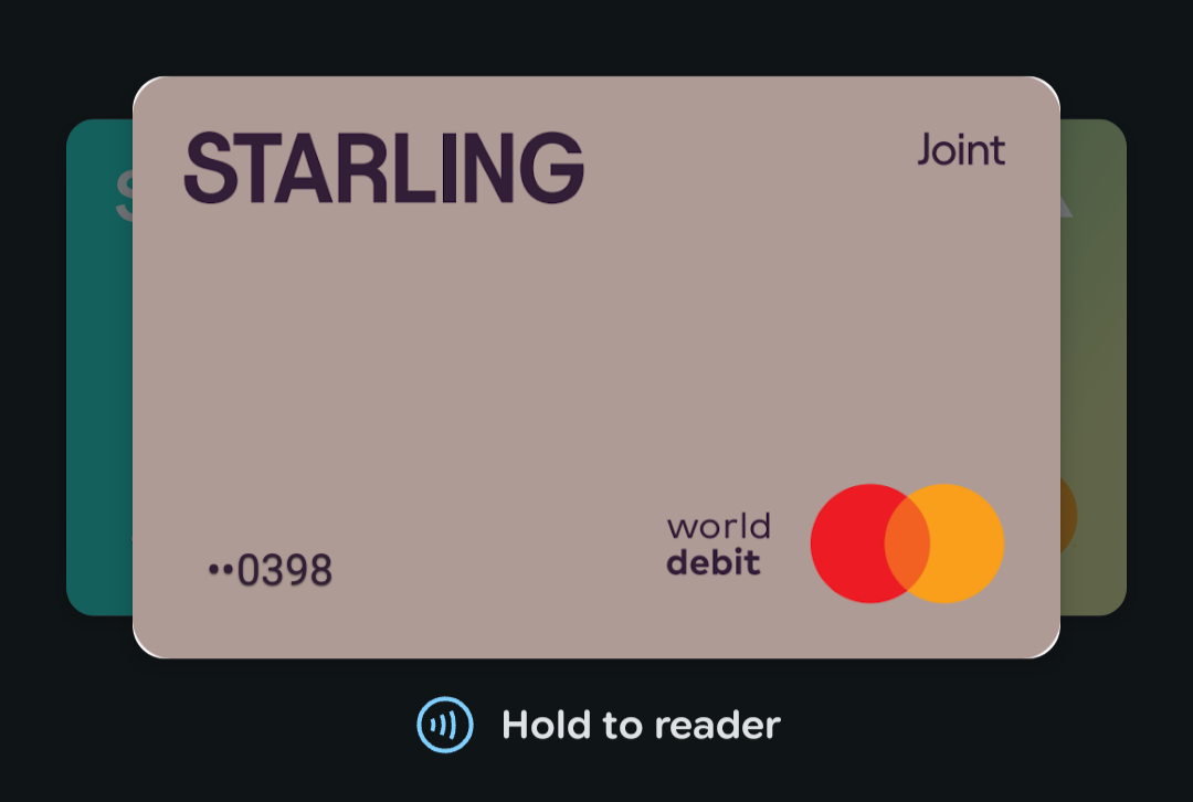
Yes, the font looks almost squashed, making it narrower and taller than it used to be. That part I’m not too keen on. I liked the old font, as it was clean and easier to read.
Something just occurred to me; I’m a little surprised they didn’t roll out Liquid Glass at the same time as their refresh. Would have made ti feel more substantial.
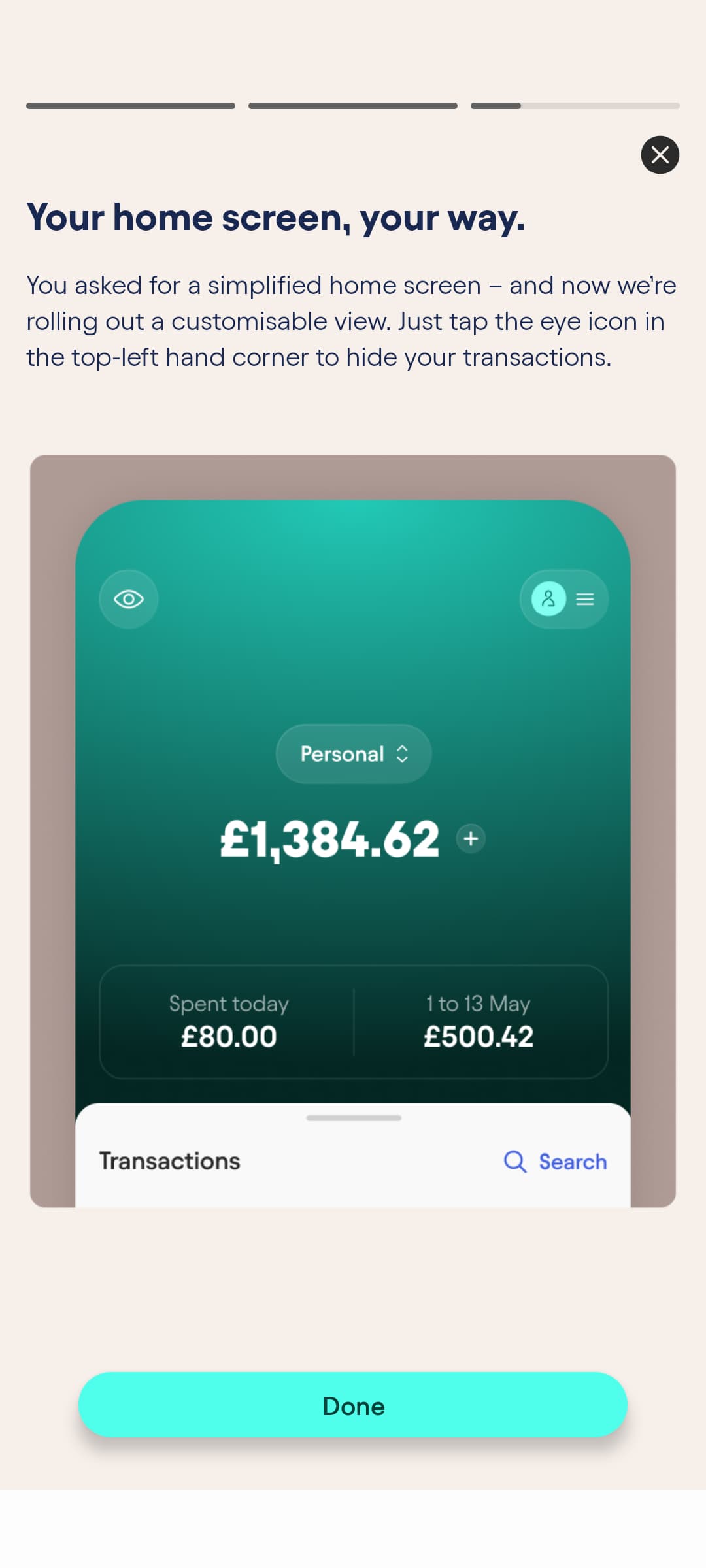
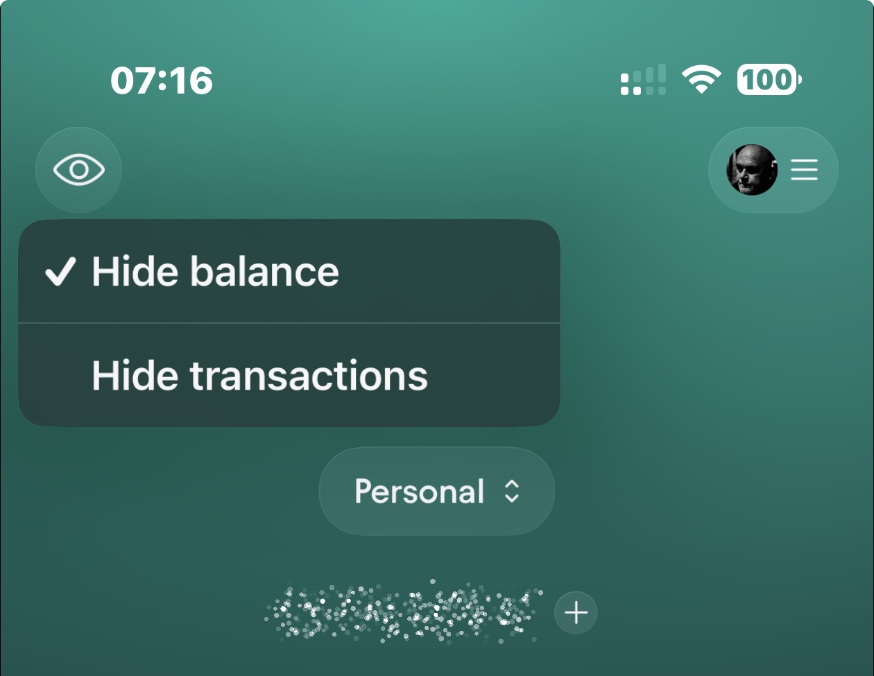
There is no eye icon in the top left for me, is this incoming or am I blind? Ah, seems that “gradually over the week” applied to everything, not just the Apple Wallet slide.
They’ve also slightly changed their PDF statements. Used to show the transaction feed friendly merchant name for each transaction, but now it shows the full reference details instead.
So now they’re now the full reference from the merchant? Personally, I think that’s better.
I had an issue a while back where a merchant was completely wrong on the app (they were the other end of the country), but in reality it was local. The reference was correct, the app wasn’t. But that meant my bank statement was also incorrect.
I’m with starling on this. If there’s ever a dispute, it’s much easier if the statement shows accurate information, not edited/stylised/best guess info.
Upon reflection, I see the value of having the merchant data. I will say that it detracts from the beauty of the simplified version but, hey ho, it’s there for an important purpose.