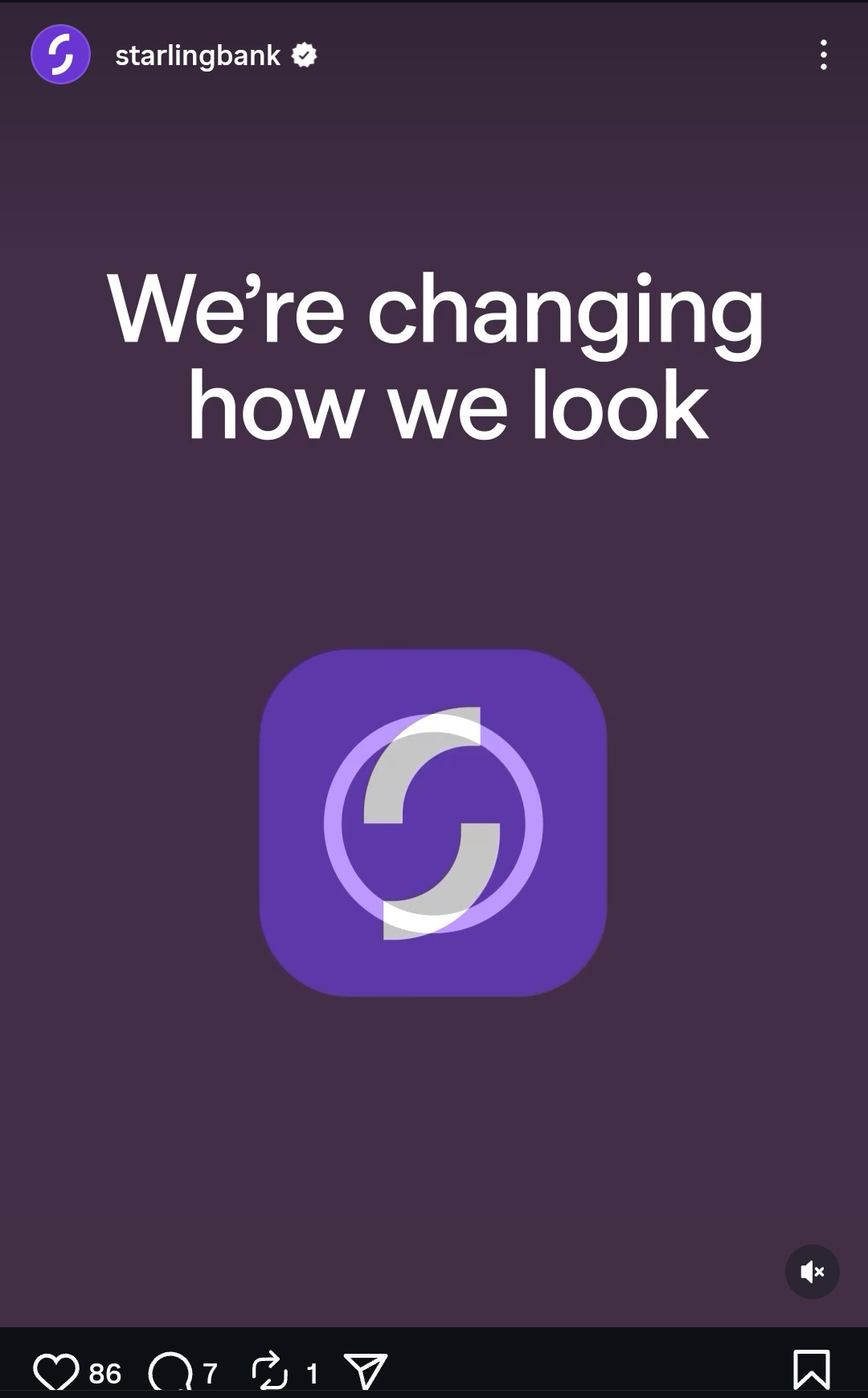
Seen this on Instagram ![]() Didn’t they refine their look not so long ago?
Didn’t they refine their look not so long ago?
1 Like
What is the new look? That video only lasts 3 seconds and the logo doesn’t look any different…
I’m not sure about the big butt on that S, but I don’t dislike it overall. I quite liked the old logo though.
It looks a bit same-y to me. Not sure I’m a fan, but time will tell…
I’m curious, where did you find that?
That’s awful.
2 Likes
It was in their email to me. They wanted to give customers a head’s up so, in their words:
Scammers sometimes try and take advantage in times of transition, so we’re giving you an overview of the changes in advance.
1 Like
The new designs are nasty.
1 Like
I’ve a lot of time for Starling, but this look is in no sense an improvement. It’s always looked rather elegant. Not so now…..
5 Likes
Looks like a railway station chain cafe trying to be trendy 10 years ago. Cack.
2 Likes
I think I object to the colour scheme more than the typeface or logo, but none of them are good. Oh well, it’s not a deal breaker for me.
2 Likes
downloaded my starling app again. overall i’m convinced that the app is still a lot smoother than alternatives and without the bloat that Revolut have, while much more professional looking than Monzo
I just wish one of them would let you add nicknames to merchants (per transaction and generically) and I wish one of them would let me either a) upload my own logos or b) switch to categories only (like N26 did).
1 Like
I genuinely don’t understand the Monzo app. It is a chaotic mess.
2 Likes
I find it straightforward tbh. But then I don’t have a joint account messing up my transaction lists or bill pots.
Wonder how much this rebrand cost? There was nothing wrong with the old logo.
2 Likes

1 Like
Actually I kinda think this one looks worse
2 Likes
I’d probably use Revolut exclusively if they moved hidden items to the server (instead of having to rehide everything on every install) and made some small changes. I really wish their paid plans could be slightly altered (like being able to remove subscriptions/insurances, even if it’s not “remove them individually” but move them as a whole).
I may give them a look if they ever become a proper bank and up their fraud game: Revolut: More than 100 customers contact BBC about scams - BBC News
…but I will stick with Starling for now, even though you still can’t automatically transfer into any of their interest-bearing savings accounts. I still think that is weird.
They are technically a proper bank now, although they’re not using their licence for anything right now because they’re not a bank without restrictions on their licence
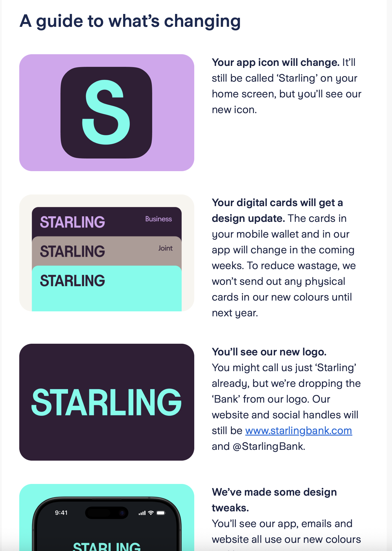
The new look appears to be live…apart from the favicon. https://www.starlingbank.com
3 Likes