I’m on the latest version of the Starling Android app and have noticed some disappointing changes to “Spaces” this morning.
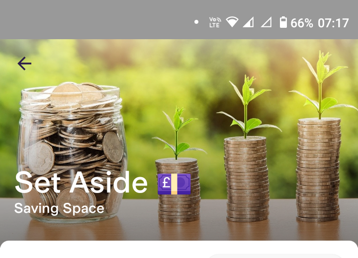
I now can’t read the space name if it has an image with a light background. Some of my spaces now have white text on a white background. They used to have a semi-opaque panel behind the text to make it visible on any background.
Also, they’ve changed how you add and remove money. It now shows the overall available balance including any overdraft rather than the main account balance.
Seems like tinkering for the sake of tinkering. Frustrating that unnecessary changes are being worked on, whilst other app functions that could do with some attention, such as the “Spending” screen, have been neglected for some time
There are already reviews complaining about this so I presume they will revert back to the way it used to work. Why they keep doing things like this I don’t know 🤷
Are the changes only on the individual space screen? (Rather than the list of spaces?)
The balance thing must be a bug. On iOS I’ve noticed the balance doesn’t update in real-time anymore when entering the amount to withdraw, but it still shows the main account balance.
All they have to do is bring back the panel underneath the text - a semi-opaque text background that meant it looked fine no matter what image you use. The new screen is difficult to read on almost every background I have, light and dark. It isn’t just contrast - the text is just overlaid on whatever image you use, so if there is text in the image, it all just blends into a garbled mess!
Yeah, it’s on Android. These are the type of bugs that really infuriate me… the obvious ones that should be caught in any sort of rudimentary test process.
On the plus side, the transaction history that they’ve added to spaces is a big bonus. The lack of any breakdown of transactions was one of the reasons I stopped using my Starling account.
It looks to me like they’ve just redesigned the screen but not considered how the text looks on various images. Pretty sloppy I’ve tweeted them and got the standard, “thanks for the feedback, we’ll pass it on”.
The process of withdrawing from spaces, then doing whatever you’re going to do with the money seems to take ages. I’d like to be able to send money directly from spaces to a payee.
What changes have been made to spaces? Recently being allowed to open a new Starling account after making the mistake of leaving last year. Really glad to be back with them, but haven’t had the chance to use the spaces again yet.