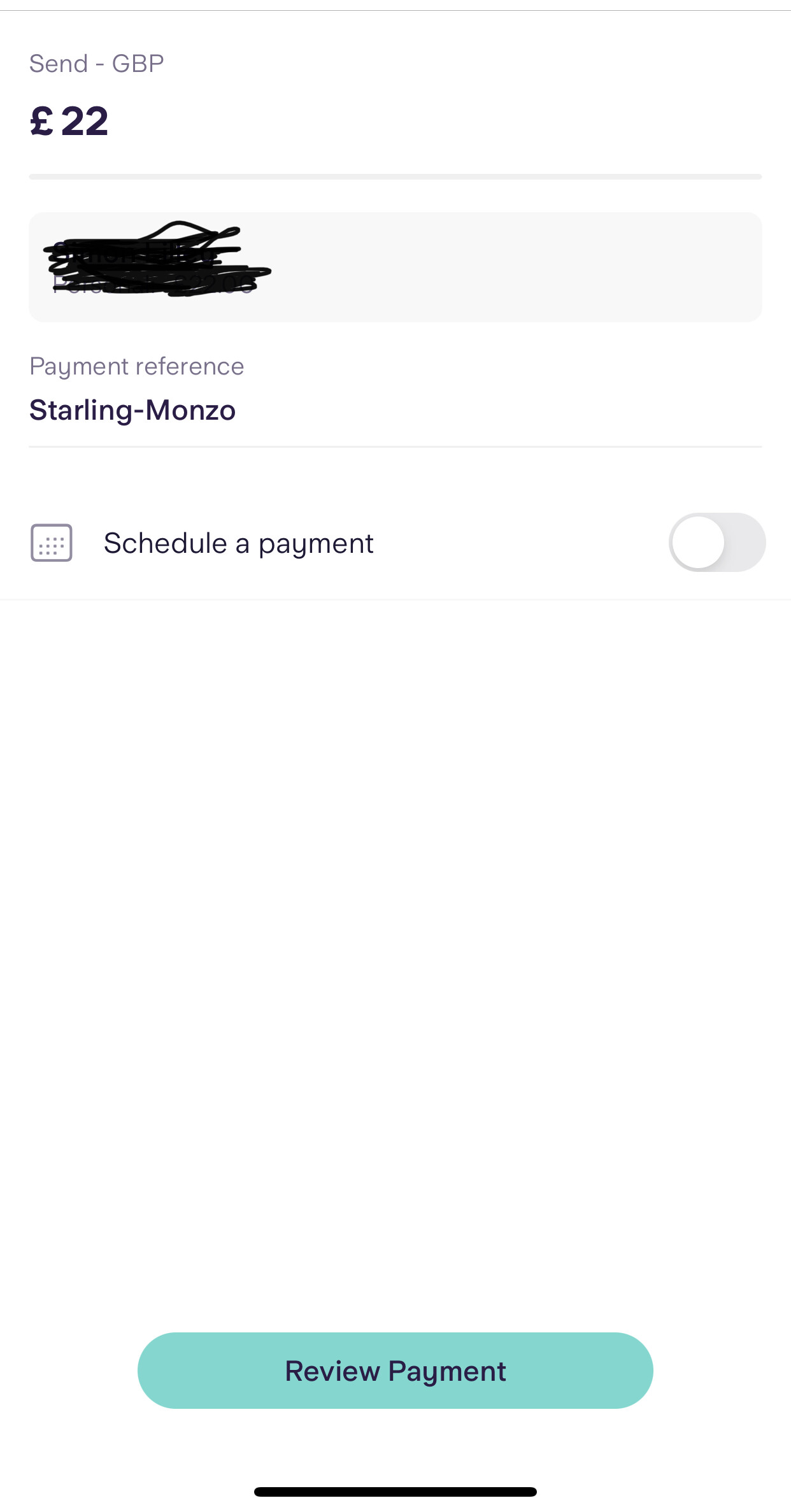
New payment screen
3 Likes
Normally I’m all for removing friction in apps, but I actually found the old Starling payments UX a bit too streamlined for my liking - just a single tap and the money was sent. I welcome the addition of a confirmation screen.
6 Likes
Just tried that must and that is really cool.
4 Likes
iOS 2.1.0 released.
Usual ‘squished a few bugs’ crap, not that I’d noticed anything out of sorts.
Oh, and this time, a Pride flag icon if that’s your thing.
To be honest, rather than mucking about designing custom icons, Starling would be better off implementing stuff that makes a difference to your everyday banking. But hey, what do I know 
3 Likes
I suspect it doesn’t take that much time to do the icons, and the designer making it probably wouldn’t be able to deliver a whole other feature end-to-end.
I’d be very surprised if Starling had a feature ready to go but were like ‘hold up, delay that a month we need to let Dave finish that pride logo’.
2 Likes
Yup, they’ve had the system for changing the icon in place for a while. Was probably as easy as getting the designer to add the pride flag icon and a developer adding an extra line to a file.
1 Like
Yes, although I’m a bit surprised they’ve designed a new Pride logo, rather than simply add back the one they have used before?
This one has some extra lines to it, but I am personally unaware of the significance of those?
The black and brown are to represent LGBT+ people of colour. The light blue, pink and white are the colours of the transgender flag.
As a member of the LGBT+ community, all this messing around with the flag annoys me somewhat. The original 6 colour flag is supposed to represent all members of the community. By adding stripes to represent particular subsets of the community, the flag becomes exclusionary to those who are not given specific representation.
9 Likes
Thanks for the explanation, I wasn’t aware of the detail there.
I suppose these things always end up missing off some people, and the purity of the rainbow idea probably did work better - but it seems lots of people do like this new arrangement, so who am I to say anything!
Well due to a recent home move, I’ve neglected my duties slightly!
So Starling on now on v2.3.0 if anyone hadn’t noticed.
2 Likes
Thanks. I haven’t neglected very much at all lately [I’m sure I’ll be told differently shortly] and I hadn’t noticed. R-
1 Like
For those chomping at the bit, v.2.4.0 now live.
1 Like
Yawn, v.2.5.0 now live as of yesterday. Clearly after just 5 days since the last update, they feel it requires yet another one.
1 Like
An another one! This one brings something new: transaction details in Spaces.
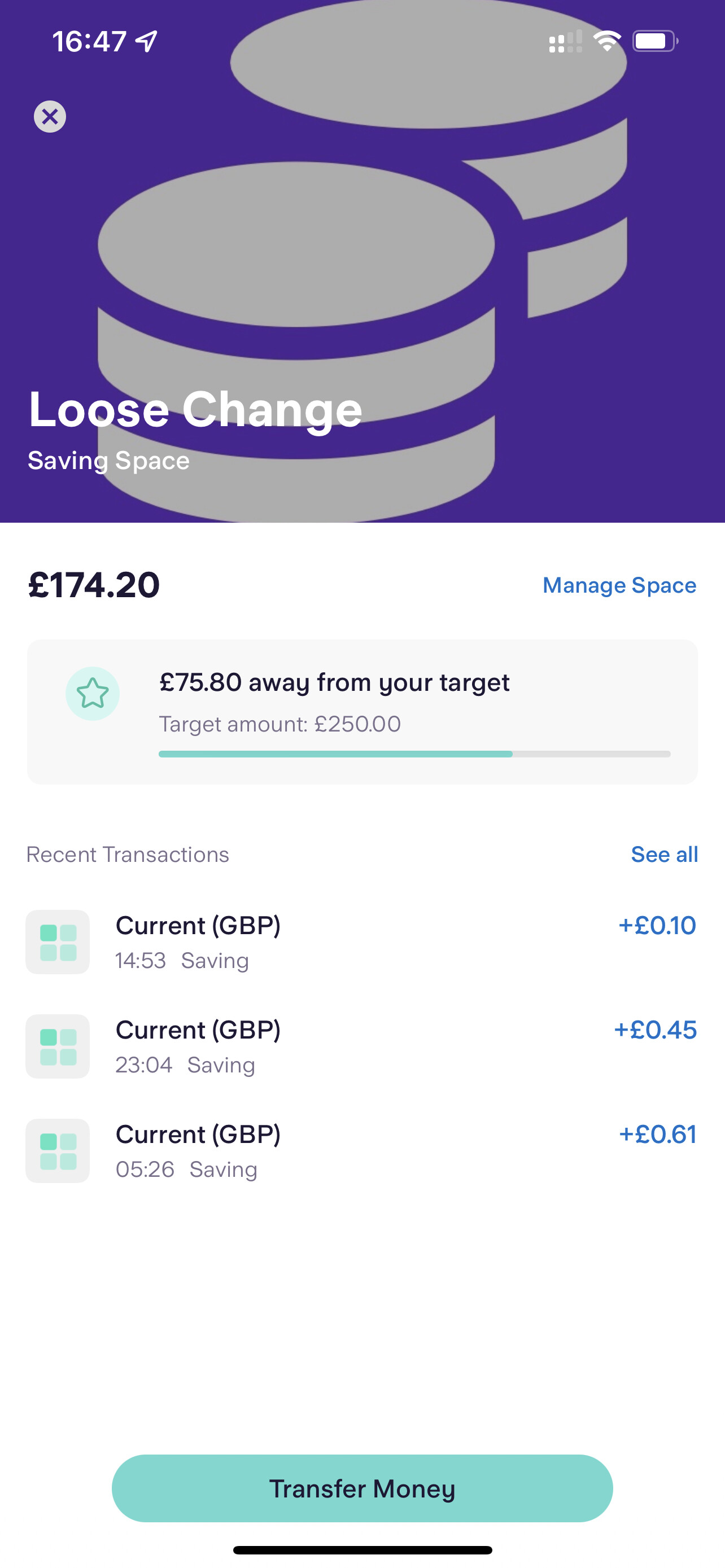
A couple of faults though: the initial screen only shows the time of the transaction, not the date. And it doesn’t include Round-Up transactions in the list.
2 Likes
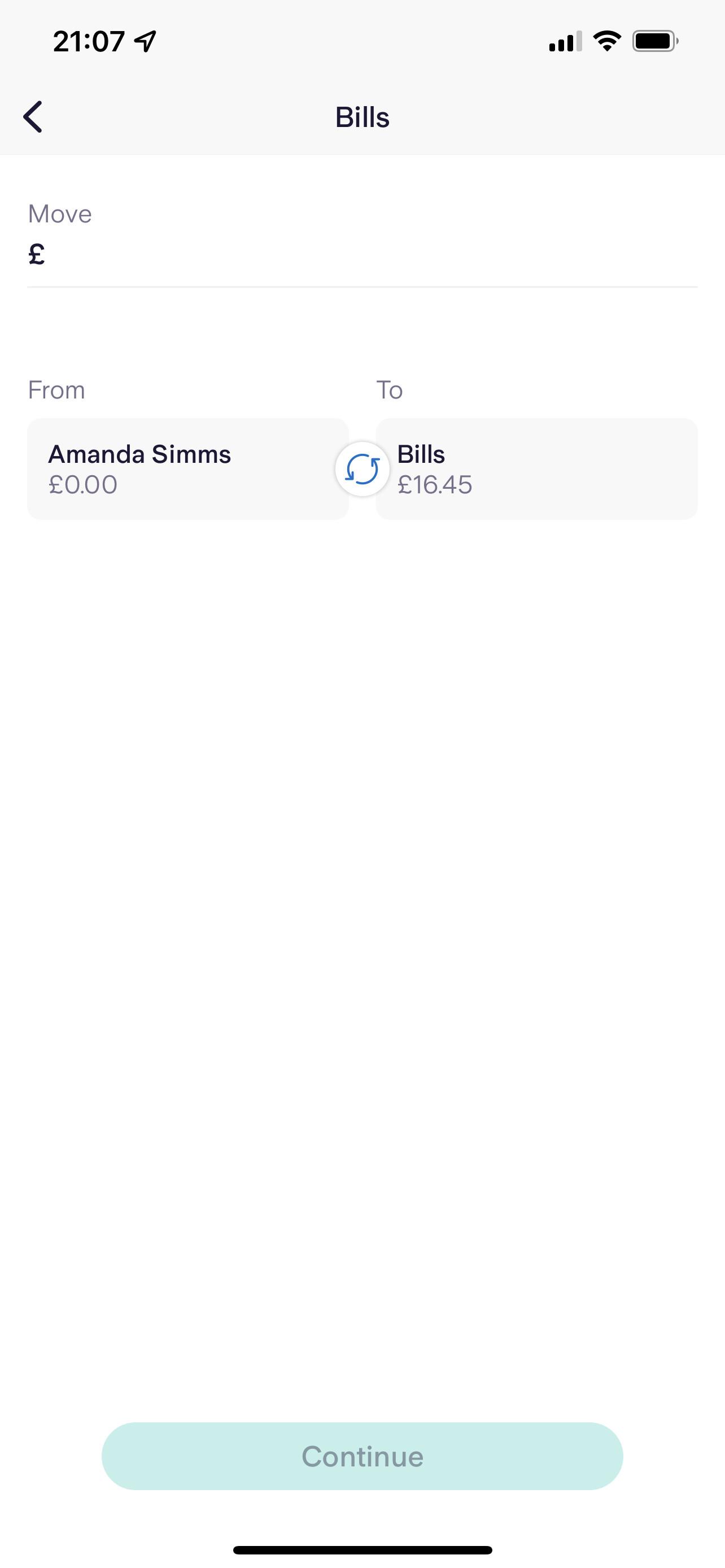
I hate what they’ve done to Spaces in terms of how you add or remove money. The old way was obvious and worked well. This seems quite convoluted.
1 Like
I’d quite like the ability to move money from one space to another without having to transfer it via my main account.
8 Likes
What I don’t get is why the UI is at the top of the screen where I can’t reach it…
1 Like
They could have just stole N26’s way of transferring between spaces/accounts and they’d have done the best thing for usability
3 Likes
I know - I have similar reservations about the new payments and transfers design.