Absolutely, it would have been so easy to simply port over the portrait lion from Hong Kong and be done with it!
The cards all seem to be the same shape and design which is a shame. Have we lost horizontal cards going forward.
I’m guessing the trend for UK cards to be more “accessible” is one reason why the designs are different.
There’s nothing inherently inaccessible about the Hong Kong design.
They could easily add the “braille dot” and design it with large numbering, etc on the reverse.
Probably. The only reason for horizontal cards to be that orientation was for the magstripe and embossed numbers (for zip-zap machines). Now that both are on the way out, portrait cards just make more sense really.
As Starling said when they announced theirs, it reflects the way we use cards today (in cash machines, card readers and even often wallets, it’s always a chip-first portrait orientation).
I don’t think so, vertical cards are becoming quite common, but by no means universal. Lloyds Cashback credit card, which they only launched a few weeks ago, is still horizontal. Nationwide, First Direct and Santander have all recently redesigned their cards and they’re all still horizontal. Barclays let you have your own design on debit cards, but there’s no option for vertical pictures, only horizontal ones.
On top of that my understanding was HSBC was meant to be the expat bank, really. An account you could take anywhere based on a relationship that HSBC would likely have with you, in your home country.
Kind of diminishes that apparent brand value and ease of representation if the brands look entirely separate
They’ve sort of moved away from that over time, as RBS have done, since the financial crisis.
They once proudly boasted that they were the “World’s Local Bank”, but since those days they’ve sold off smaller or unprofitable parts of the business, focused more heavily on core markets and invested in operations in Asia (RBS has similarly refocused, but on operations in the U.K.).
But I still agree with you that there’s little point having a consistent global brand if the branding itself is not cohesive.
It definitely an Asia focused bank.
The cards don’t need to have the same design in all markets, just have common elements such as the name and red hexagon on them.
That said, I do like the tiger design - i reminds me of HK as the HSBC bank notes had it on them on my last visit.
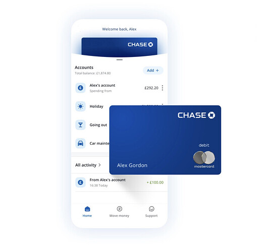
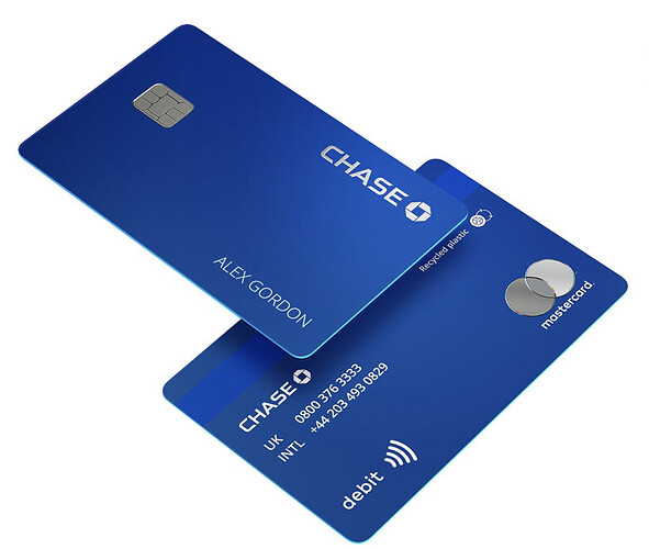
I’m curious which form the new Chase debit card will take; on the front page of their website today it shows two different editions. Neither have the PAN number, but one has the Mastercard logo on the front while the other has it on the reverse:
and
I think I prefer the network logo on the rear so the front is more minimal, but either look good compared to many other issuers.
They’ve definitely said it will be numberless. I wonder if the first image is how it appears within apps / mobile wallets, with all details (debit & logo) visible on the “front”, and the second is the actual card image, with some elements located on the back (which I do like).
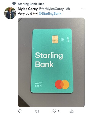
Was just quickly scrolling Twitter and came across this…
Got to be honest, I’m not a fan. I see it’s using their new logo’s typeface, so I’d expect this design to filter across to the non-joint debit cards as well at some point.
I hate it, it looks like a cheesy mockup.
If they have to have large branding on the card, why not use the S logo instead, like the old purple card?
I’m not a fan of a weirdly-sideways “Joint” text either. Why not just use a top corner and have it like normal?
Well done Starling. Start with something minimal, groundbreaking and perfect, and then slowly fuck it up bit by bit.
I personally wouldn’t call their first gen portrait design perfect (a bit too much empty space for my liking, and the teal looks like the colour of an old granny’s Peugeot) but I agree this is definitely a step backwards. Looks like a Fisher Price edition or something!
I still prefer the Original Starling purple card… I know im a bit odd, but its looks nicer…
I liked the addition of the World Debit text.
The other tweaks, not so much!
I like how the joint text would peak out of the pouch on my wallet.
There is way too much line spacing on that Starling Bank logo though imo.
Wouldn’t that be Monzo?
Good god that can’t be real?


