NatWest has ditched the fingerprint reader then? Good.
The fingerprint-reading contactless cards were only ever a trial for a limited number of customers.
I wouldn’t be surprised at all to eventually see them back; as the cost of producing the cards comes down and the cost of contactless fraud goes up, eventually it will be in the interests of banks to switch to fingerprint-authenticated contactless cards.
I imagine in the future it is likely that there will be no contactless limit and all contactless transactions will be processed through authentication (with either a device authenticating, or a contactless card with fingerprint reader included).
Not a green card in sight! ![]()
![]()
Mastercard are introducing cards with three different kinds of notches in them to distinguish between credit, debit, and prepaid cards:
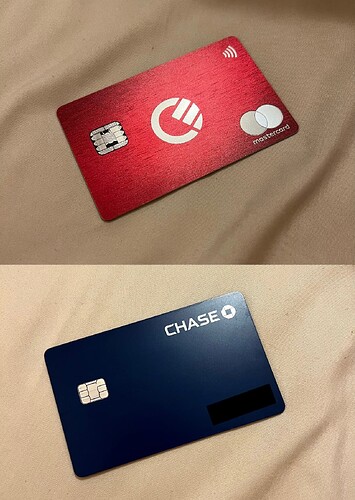
My Curve card & Chase are probably my favourite more recent designs, used to love whipping out my N26 transparent card. Also, this is my first post so hey ![]()
Welcome, it’s great to have new members joining!
I really like the look of that Curve Metal card in person, it’s very simple but great design.
Hi Charlie, and welcome!
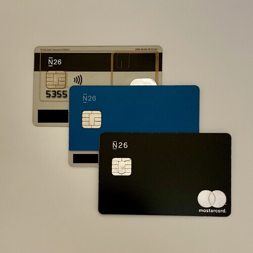
The N26 transparent card is hands down my favourite card of all time.
In fact, the entire N26 lineup of cards were pretty nice! In general.
Here’s my collection of them!
Quietly classy.
Just noticed I’d already shared it on here way up near the top the thread! Whoops! 
Hello Charlie, welcome to the forum! ![]()
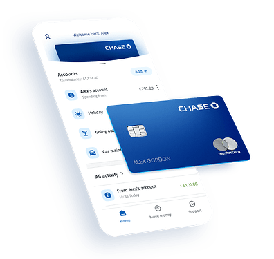
Must say I’m a real fan of the Mastercard World Elite logo - I personally wish Chase had stuck with their original design that I believe an early cardholder informed @anon62610374 of (and the one that is still used for Apple Pay and in the Chase app) with the silver MC circles on the front!
This was the post that indicated the card layout used in the app was the design of the card, not the others shown on the website.
here’s the post they were replying to:
Based on the tid bits I’ve pieced together, I believe those with early access were given different card designs, as another with early access had a card completely different to any of the renders we saw, and different to the card that user had. Here’s another where it’s just the logo sans the name on the top left of the card.
https://twitter.com/elibelly/status/1439913994886828044?s=21
The marketing materials and press photos show two distinct physical card designs being used as well. The design that user at Monzo believed to be the correct design as it was the card I presume they were given, and the design we ultimately wound up receiving.
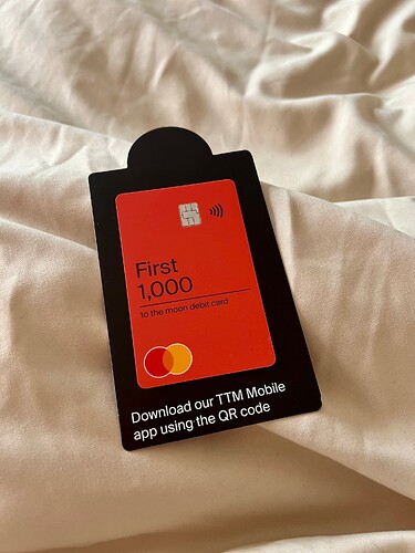
Don’t like it – their brand is much smaller than the First 1000. I’d think it’s a first direct knockoff if I didn’t know what it is
I’d rather just have the different colour and a small XXXX/1000 on the back
This has blown my mind. Cash App cards have the logo ON THE CHIP 
That’s very cool and sleek!
god damn, when we gonna get full Cash over here 
Yes, i know this has been posted over on the ‘other’ forum already - but nevertheless.
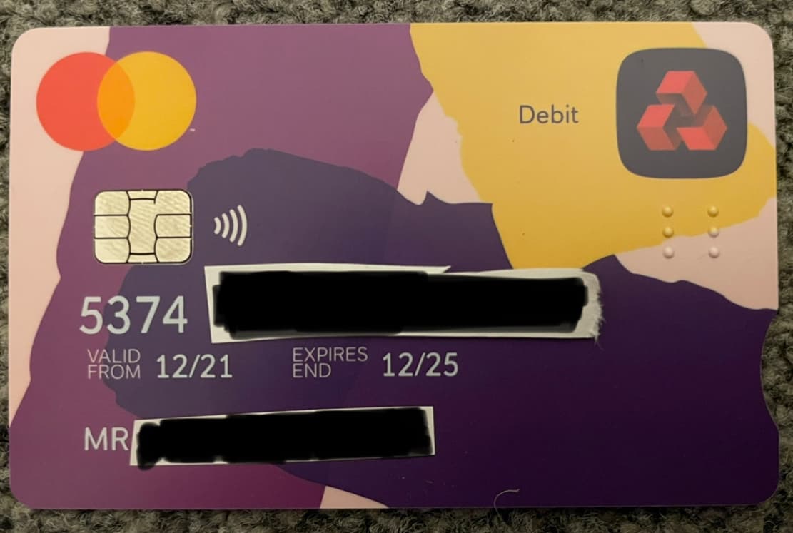
Received the new NatWest Mastercard Debit today. I reported mine as damaged.
Although it’s an unpopular opinion, i’d actually say it’s quite a ‘nice’ design with regards to it’s uniqueness and the fact it’s not a standard layout cough most portrait cards cough
Also, no sort code on this card either - seems they’ve completely moved away from having account details on the card (although can’t ever recall them putting account numbers on cards?)
Maybe this is just my personal opinion, but I feel that white (or light pink) simply never works on cards.
That’s part of the reason why the card seems so odd, to me.
I wish someone with an RBS account (just a basic one) got a replacement card to see if it’s all of RBS lagging behind or if it’s just C&Co
It appears existing customers do get new cards, at NatWest anyway
I can’t look at that without seeing Atom bank’s logo. Especially in the real life renderings.
