If I had a pair of dogs right now… ![]()
(Sorry - back onto topic. ![]() )
)
If I had a pair of dogs right now… ![]()
(Sorry - back onto topic. ![]() )
)
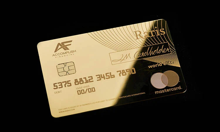
Reminds me of that card (can’t remember which bank but it’s an Emirati one I’m fairly sure) that has an actual diamond embedded in it!
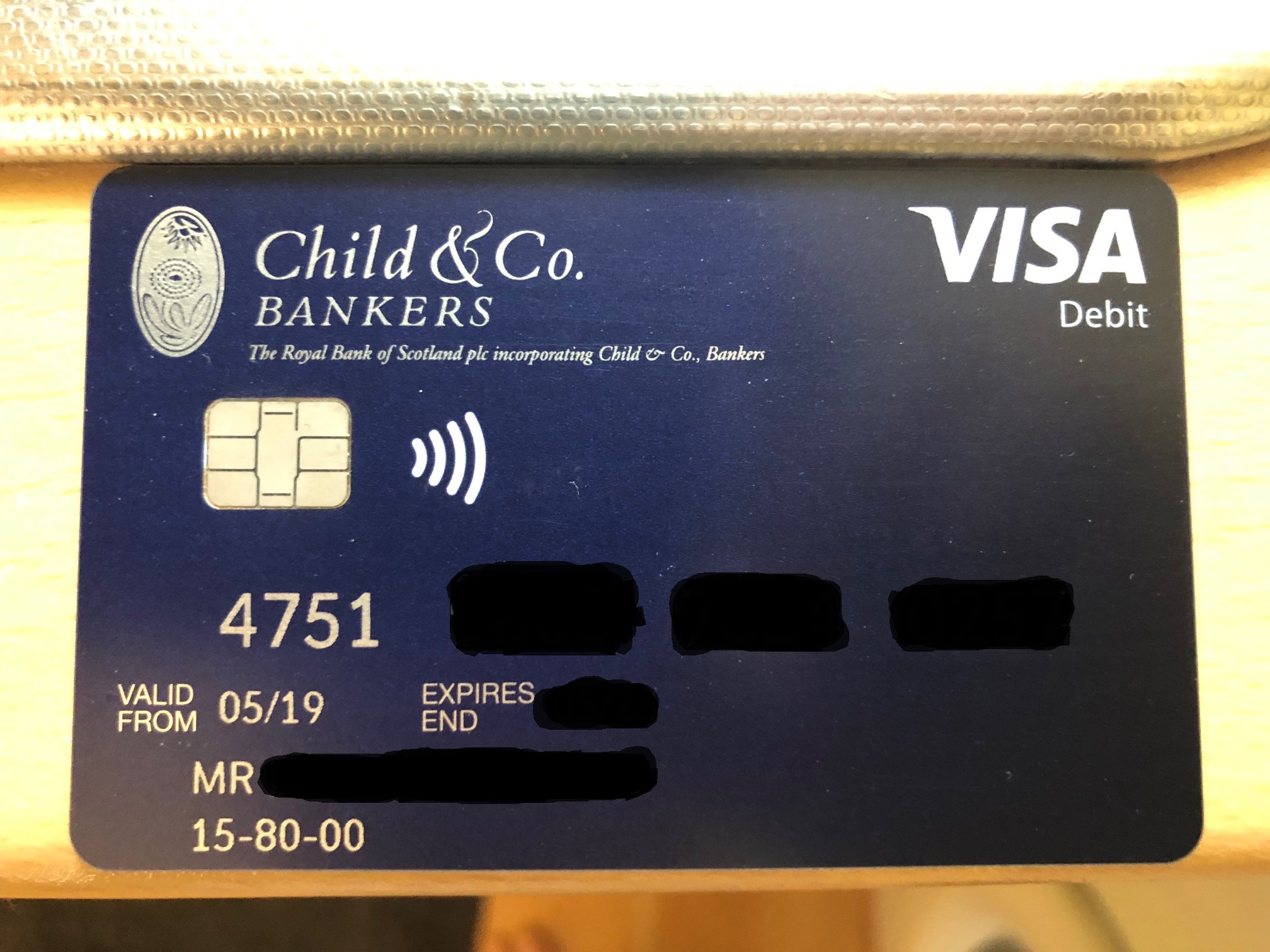
I thought now would be a good time to share the Child & Co Private Bankers debit card ![]()
Source: MSE Thread
I think the Child & Co card looked a lot more handsome before the accessibility adaptations. Shame they couldn’t have made them optional.
Can confirm, I’ve had one for a while and the first one I had looked the best. It had no contactless and was embossed, with a small chip.
Then they added contactless but the chip seemed to be made huge as a result which was visually distracting, and it stayed embossed.
Then they dropped embossing and the chip shrunk again, but the overall quality reduced.
Judging from the photo by @JonasP from MSE, that version of the card looks like it’s made by the same folk who make Monzo’s cards and the new grey coloured barclaycards. Cheap flimsy crap with low quality prints and a poorly aligned chip hole. The printing on my Barclaycard is so dreadful it looks counterfeit. Like those paper cutouts that used to come through the post when I was a kid.
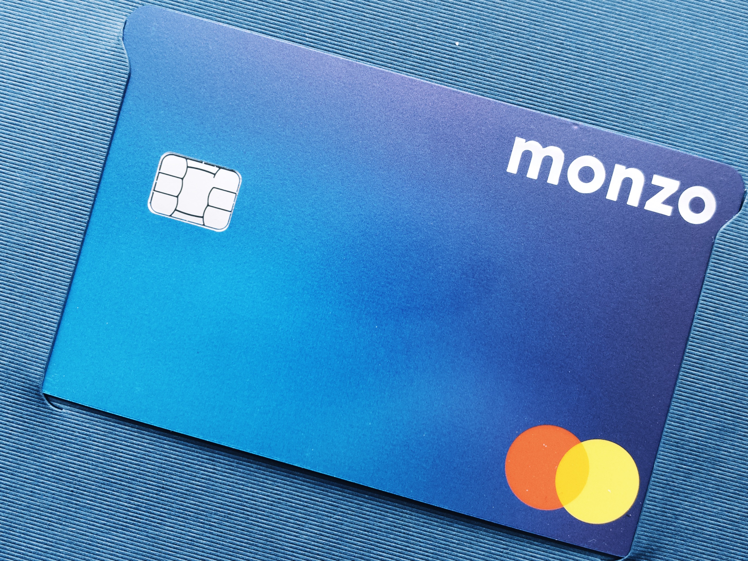
The poorly aligned chip really annoys me with the Monzo Plus cards, they feel a much a higher quality, and the finish is excellent, but the misaligned white boarder around the chip really ruins what is otherwise an excellent card.
You can see the issue quite prominently on mine here:
I used to find Nationwide cards cheap and easy to scratch. I think in my experience Lloyds and TSB was the best quality card I had in my wallet
I agree with you about Lloyds - cards from the whole group always seem sturdy, and they don’t produce cards with smeary-looking prints either.
TSB’s new cards are high quality and I do like the shiny Visa logo they’ve used.
TSB’s new cards look absolutely stunning.
Triodos’s cards still feel like those high quality embossed bank cards from the olden days that felt substantial and sturdy and had a glossy coating to them. Last bank card I had like that prior to Triodos was my old NationWide smart card!
That misaligned chip is the sort of thing you don’t notice at first, but then look closer and it hits you.
As soon as you see it, you can’t unsee it, and then you find your eye gets drawn to it constantly!
A shame, as the card does otherwise look very nice indeed (and more professional than Monzo’s standard card which I don’t really like).
I have just checked my hot coral card and the chip is also misaligned. Apple Pay only going forward 
The misalignment was so obvious to me with the Monzo plus card, because the core is white rather than matching the blue gradient. So it sticks out like a sore thumb, where other cards could otherwise get away with. I’ve noticed similar with my other cards since.
The only cards I own where this isn’t an issue are either metal, or transparent, or white.
I’m going to have to check all my cards to be sure, but I think most of mine have the chip very tight against the cutout, so you don’t get the sliver of core showing.
Totally agree with you. Call me pathetic, but the hot coral really puts me off using Monzo day to day! Mind you I was at a kebab van the other day and a massive burly policeman whipped out his pink Monzo card to pay. Certainly looked incongruous! ![]()
I find HSBC and Lloyds’ bank cards to always be weighty and substantial-feeling. Although my most recent Lloyds card came with a slight peeling defect in the top left corner which frustrates me tremendously every time I use it!
Then how do you make sure everybody knows who you bank with? It’s very important.
I agree, but I would get a replacement for a peeling card as it would just annoy me too much!
Probably Lloyds, TSB and HSBC send out the best quality cards from mainstream banks. Santander and Virgin Money aren’t bad either.
I don’t particularly rate Nationwide or Monzo (both seem flimsy for embossed cards).
Starling is not bad for an unembossed card, but the back of the card is a bit messy.
Put your brightness up to 100 and angle your phone and casually tilt it so folk around can have a glimpse!
I just of course. No one ever really cares who you bank with unless the card is metal or transparent (or pink before no one had heard of them). The design is more for my benefit. I like the eye candy when I pay for stuff. One of the reasons I want Apple Card so bad is for the way it animates when you pay!
I use Apple Pay for everything and get to see my holographic blue Monzo card in its most gorgeous form, free from poorly aligned chips! As a collector of physical cards too though, I’d like the quality to be much better than what we now get.
The sheer act of using Apple Pay seems to get enough attention at the checkout as it is. It almost feels like no one uses it with some of the reactions I get.
I know, sometimes people stare at you like you’ve just paid through some kind of magic!
When will we see physical cards dropping the signature strip like Bó did? That is what I want to see next, as it will make cards much less of a worry when lost (I don’t sign my cards any more, but it concerns me a bit that somebody else could then sign them as not signing is technically against the rules of using the card).