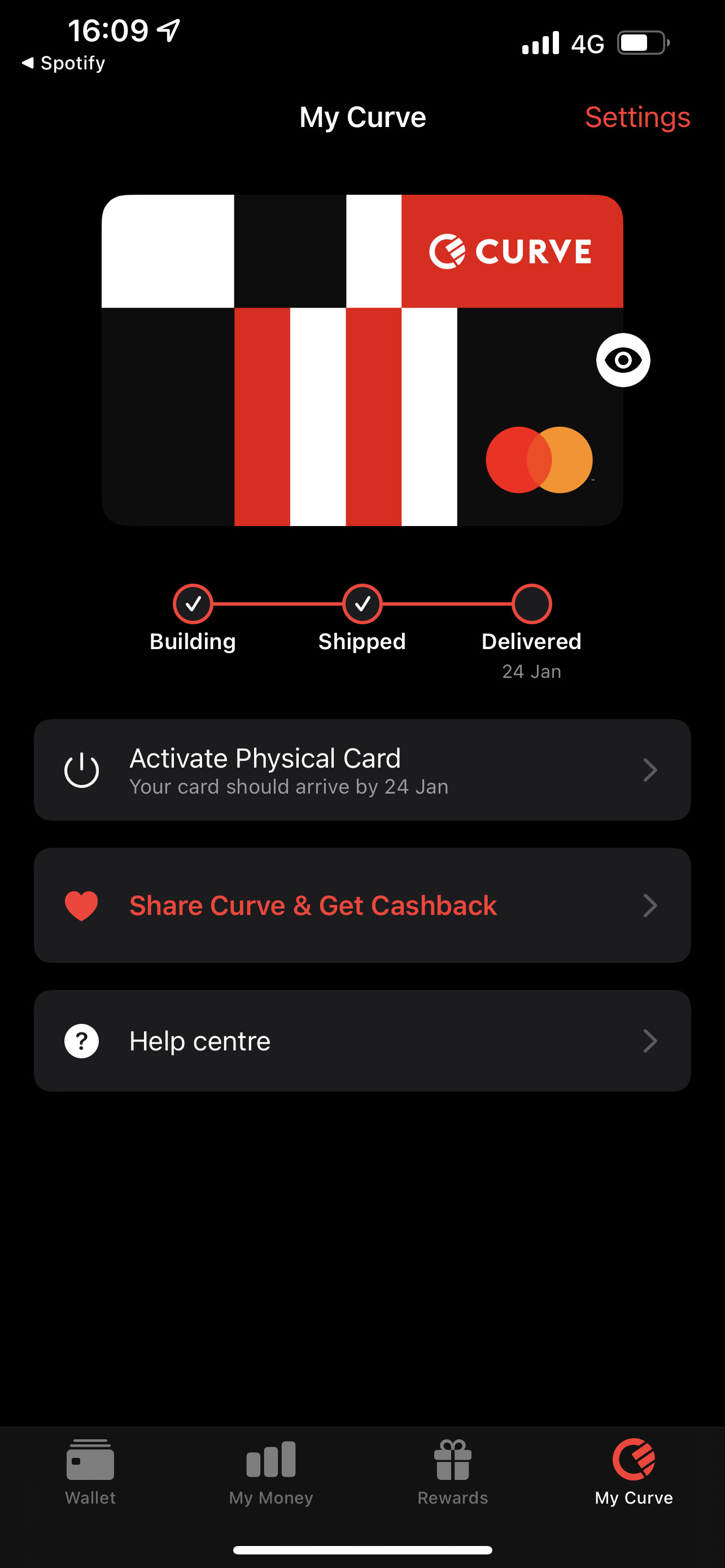
I signed up to Curve today (had a referral link which didn’t work so it’s off to a good start). Will report back how the card looks in person
Don’t know if I’ll ever use it though
I signed up to Curve today (had a referral link which didn’t work so it’s off to a good start). Will report back how the card looks in person
Don’t know if I’ll ever use it though
I know it’s all personal preference and I’m genuinely not a card fan boy at all, however, I think Chase have absolutely nailed their debit card design, it just looks professional in my worthless opinion. Possibly the most professional looking debit card I’ve ever seen.
That actually ain’t half bad.
Given most things have been taken from the back )l(sig strip and mag) they have done will with the space. Looks clean.
I’m excited to see the metal card redesign
May strip appears to still be there
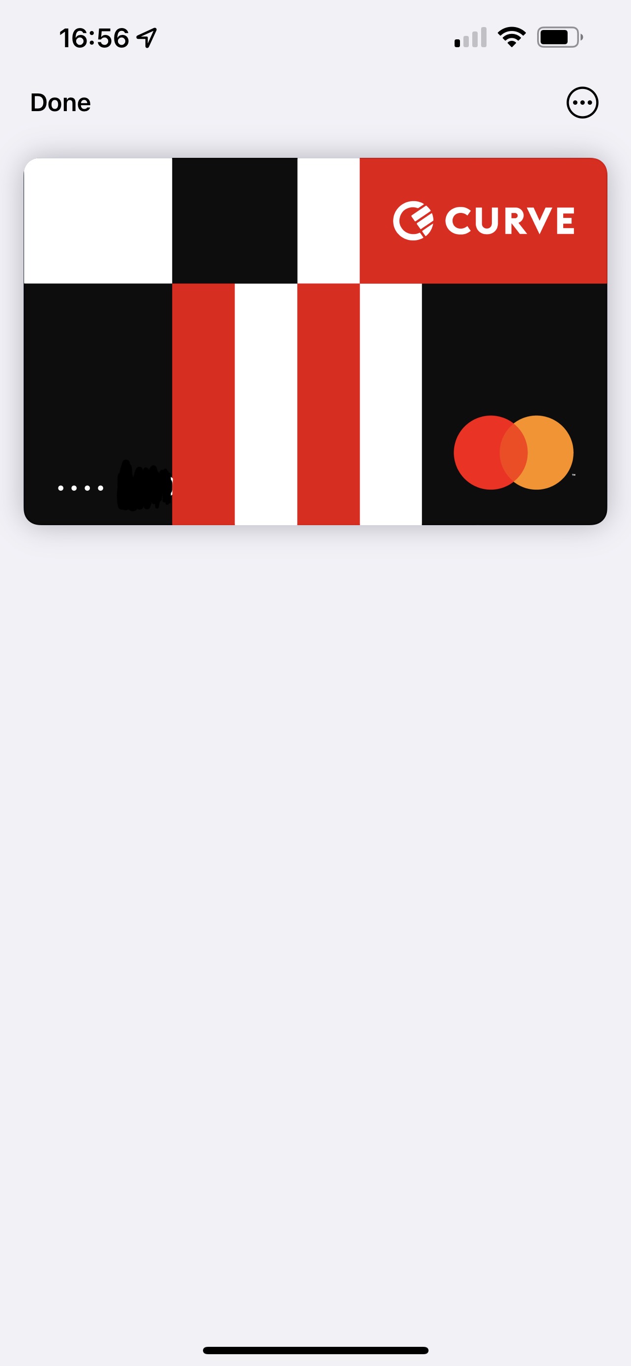
That looks like the landscape-tweaked version of their design, so probably how it appears in digital wallets?
Interesting.
Yup, can confirm:
ETA: the card image in Apple Pay is very bright. It stands out much more than other cards. Not sure if it’s the colours they use, but it almost feels like when the iPhone cranks up the brightness/contrast when watching HDR video.
I don’t mind the design – but I can’t say I ever see myself using Curve beyond spending my promotional free money. Switching payments from one card to another is just not something I ever wished I could do
I suppose that bright feeling is because, in most cases, Apple use a “white” page colour which is slightly cream and off-white.
Based on your screenshot, it looks as though they’ve rendered the white parts of the card as true white, which most interface elements aren’t.
They really should tweak that down at least a few shades, to stop the “burning my eyes” effect!
Yes, I suspect it’s because they’re using true white, and a very bright shade of red. It stands out not just against the background but against other cards too, which use more muted palettes
Conversely, the same bright shades might work well on the physical card as they probably avoid a dull look and help it stand out - like Monzo’s Hot Coral.
It’s ashame customer service is trash
How so? I asked them about my referral code issue and had it sorted in a couple of hours
Just read through the curve community for a big glimpse of the curve experience 
Pretty grim. Not so much a community forum, more a place to moan. Trouble is, there seems to be a lot to moan about.
But I digress….
On other place
Apparantly it looks really good in person
A bit like Frankenstein, perhaps? ![]()
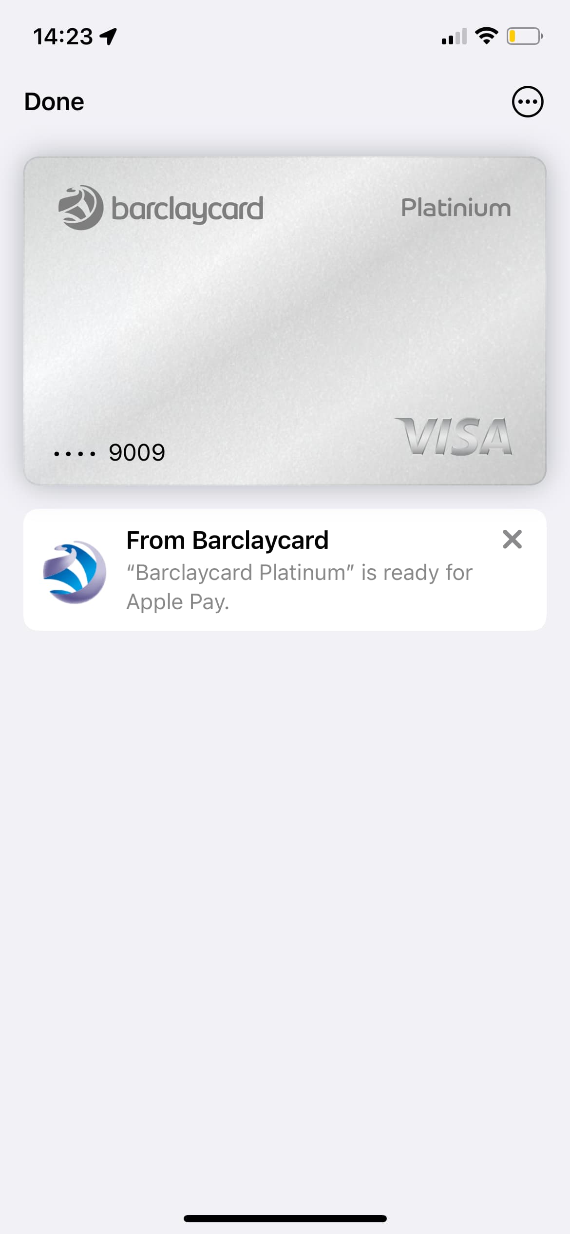
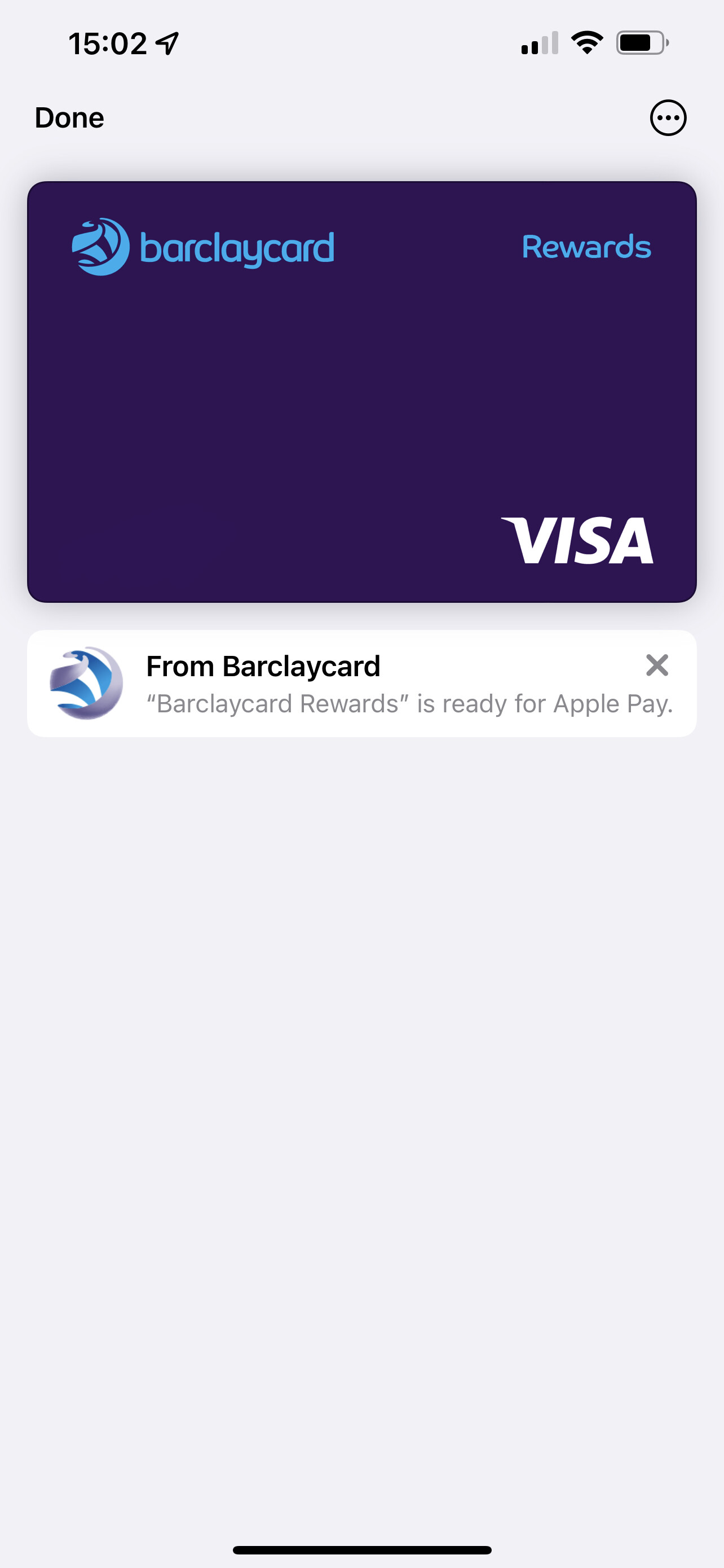
The new Barclaycard design now shows up in Apple Pay if you deleted and add it again from scratch!
Looks pretty nice IMO!
Interesting that they gave the Platinum card some sort of metallic shimmer when the renders made it seem quite plain. I doubt it will be metal, and I hope they won’t add the fake metallic effect to the card either.
The rewards card also changed, it’s a much more plain design although with loud colours
It really wants to be given the render for Apple Pay here. It would be awesome if it was too.
Alas, sadly, they’ve already confirmed that the redesigns are just part of a green washing move to recycled plastic cards. sigh