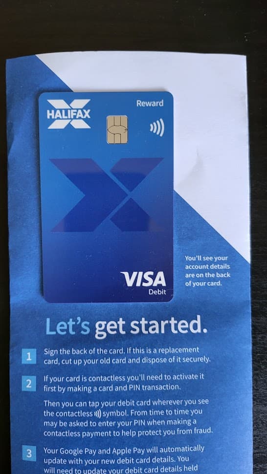
New Halifax Reward:
2 Likes
I think it’s quite nice personally.
1 Like
Yeah agree, certainly an improvement on the previous design which was a bit 1992.
Someone over on the ‘other’ forum has one of these new-new(??) NatWest cards….actually prefer it in it’s original landscape style.
1 Like
Any shots of it IRL?
The portrait design is certainly an improvement IMO.
1 Like
3 Likes
I think portrait is an improvement, but I’m still not a fan of it.
1 Like
I feel like it’s rather empty looking on the front, they need something to stand out in the middle
Taste is rather subjective. Personally, and of course this is only my opinion, all of those designs just look rather crap. I still think one of the best cards I’ve seen for years, is the current Chase debit card, clean and professional looking to the core, but again, that’s just my opinion.
4 Likes
I think the Revolut design there is pretty clean
1 Like
I have to say, I think the worst design in that collection is probably HSBC. It’s just so dull and uninspiring, and the silver especially isn’t a nice background colour. That’s a shame when the old lion design was so much nicer, and would have looked very good in portrait (as seen on HSBC Hong Kong’s cards).
The NatWest design is also quite bad, but so do think it somehow works better in portrait and at least they’ve tried something - the abstract elements don’t quite work, but it’s not as boring as HSBC.
1 Like
I think my new HSBC debit card (black and red) looks great. I’ve always liked those colours together.
1 Like
The Advance card design is better, but the standard design (as pictured) is pretty woeful and none of new designs are anything like as nice as the lions, in my opinion.
The best of the new bunch is probably the Premier design, which at least adds some swirls of colour so it’s not all boring block hexagons.
9 posts were merged into an existing topic: Using Curve
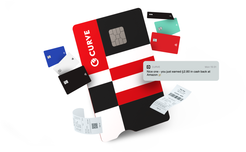
Time for some housekeeping, though….![]()
I think that was a bit overeager… at least half of the discussion was related to card design
True. But Curve got it monumentally wrong with their recent iteration. Strange that it should be so ghastly compared to the suite of cards they launched with.
4 Likes
I don’t completely hate it, but I definitely agree that their original designs were better.
There was an elegant simplicity to their original design concept, which tied-in nicely with the Curve “C” device. They’ve now seemingly decided to go in completely the opposite direction!
I suppose the new card is designed to get people to notice it and go “what’s that”!
bad product, bad design, bad user experience, bad user interface
checks out.
That it was.
Yep - they did a big rebranding exercise thinking it was edgy and happening and “down with the kids” etc.
I was modding on their forum at the time and I asked the forum manager what the idea was and why it was such a huge leap away from their existing appearance. She was frankly short of a response (she’d been caught short like the rest of us) save to say “it’s the new Curve”.
I left it there…![]()
1 Like