I had until recently 5 plain black cards in my wallet - FairFX, Caxton, M & S and 2 others - absolutely perfect for me.
2 Likes
Just posted this over on the Tesco Clubcard Pay thread, but I thought I’d leave a photo of the front and back here as well for those interested…
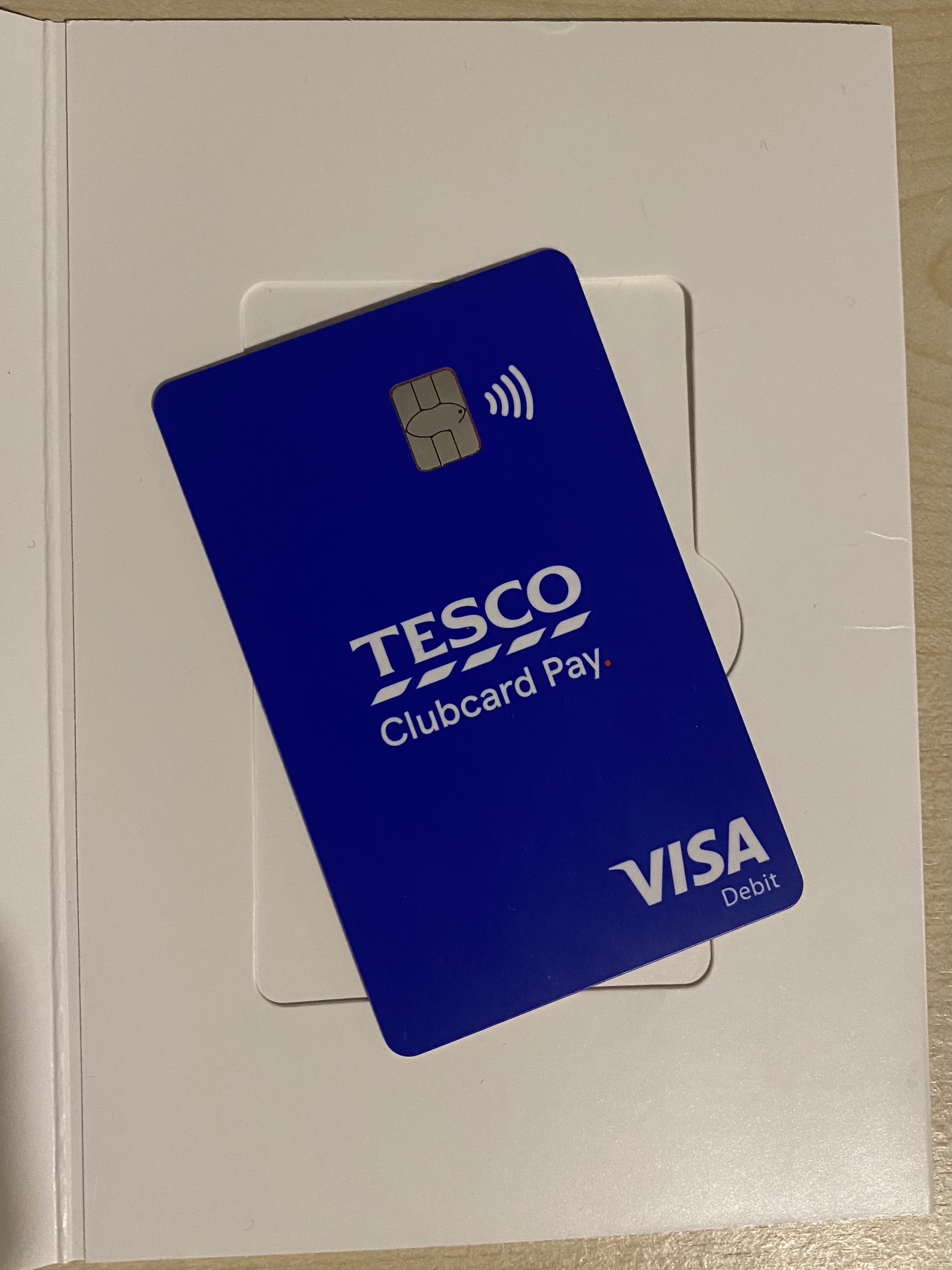
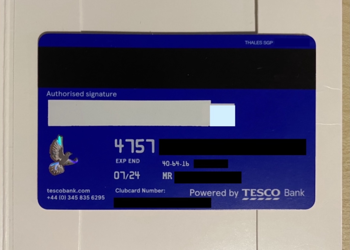
I think it looks rather boring but inoffensive. All details (including linked Clubcard number) are on the rear, which is pretty fintechesque I guess, and of it’s course unembossed. Quality feels kind of like loyalty-card level as opposed to bank card level, rather on par with NatWest’s new flat cards I suppose. Here it is alongside a Tesco Clubcard for comparison:
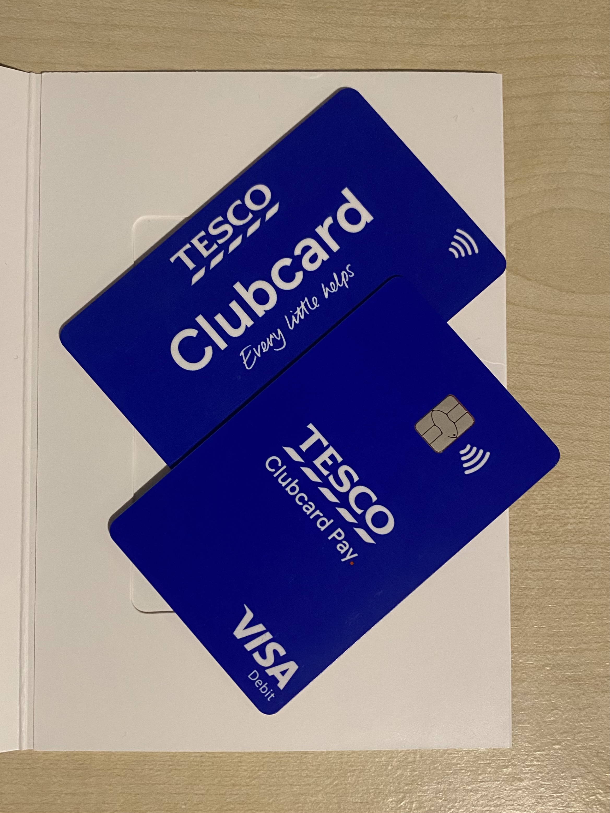
They match well and both have a red core/centre layer.
3 Likes
I love a good plain black card when they’re done right. And so many banks don’t seem to be very good at getting them right. Most of them just wind up looking tacky instead of classy.
The card looks nice!
Any chance you could get a picture of the core? It’s interesting that some banks are using a different colour for their cores than the old white. My barclaycard for example has a Barclays blue core.

1 Like
Oh gosh I had high hopes for my black/dark grey HyperJar card from the online renders, but it arrived looking like a toy with a nasty shiny finish and glittery bits on it. Plus it just feels really cheap build-quality wise.
Sure thing!
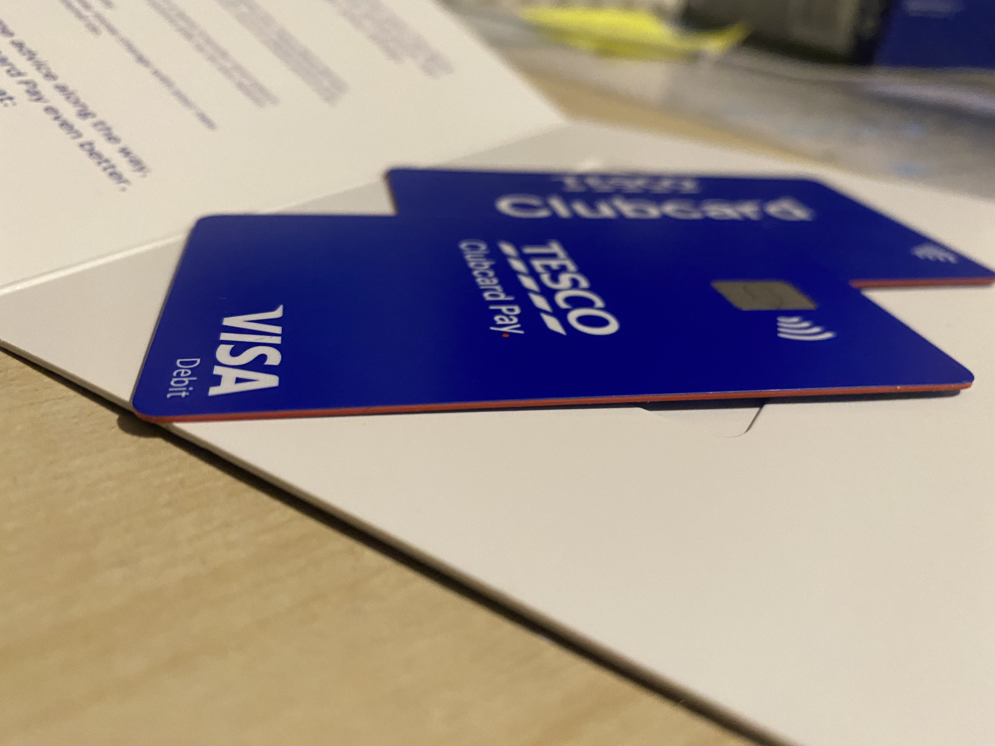
I think black looks quite nice as a core colour, as is used on my HSBC and Lloyds cards. But in this case I think Tesco have done a pretty good job at combining their two brand colours - blue and red - by using blue for the main surfaces and red as the core. It also means it pairs very satisfyingly with the standard Clubcard.
1 Like
Looks good! Very on brand for Tesco too. Nice card!
I’d love to see what else is out there with unique core colours that stand out from the rest of the card!
2 Likes
MBNA used to do charity-affiliated credit cards and I had the Cats Protection one.
It originally started out as a BT credit card - the points you earned gave you a discount on your BT bill. BT then severed its connection with MBNA and it turned into a 1% (I believe) Cashback card. The cashback stepped down to nothing over the years and I was asked to choose a charity to replace it.
1 Like
I don’t have a particular preference for a style of black card. The coloured edge on one of my Nationwide cards is good if you’re trying to find it a pile of other cards, but that’s about it.
It was my first time hands on with a Monese card today, so I thought I’d post some first impressions.
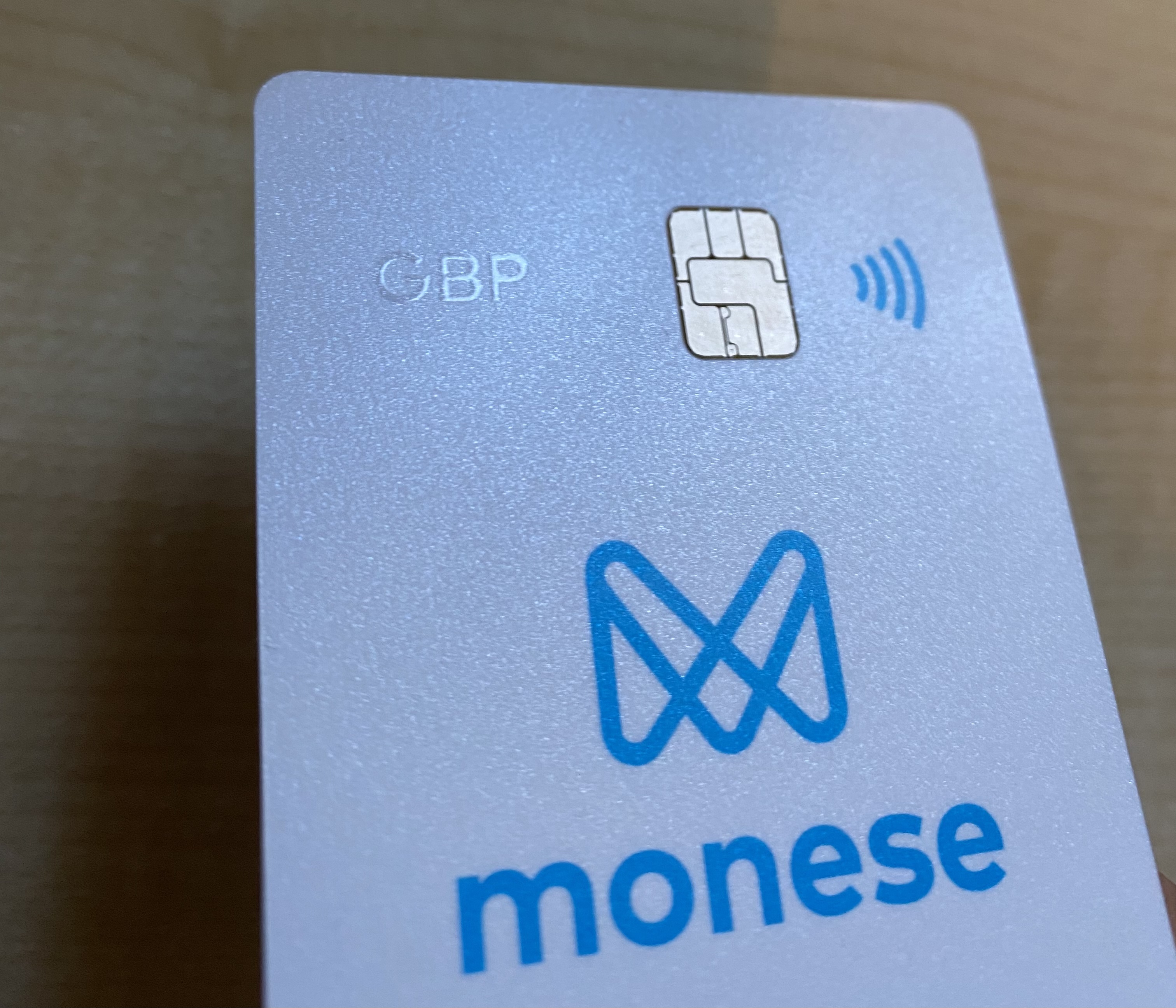
I’m on the Simple (free) plan and the white card that comes with it is, in my opinion, pretty cheap looking from the front - I think it’s predominantly the colour that gives me this impression and I’m sure the blue Classic card would look better, while the Premium dark blue card actually looks rather attractive from the renders. Also, the ‘GBP’ printed on the front in translucent gloss is basically invisible unless you hold your card at an exact angle! I’m sure in real use it’d make GBP and Euro cards just as difficult to differentiate between as Starling Personal and Joint cards… that is impossible!
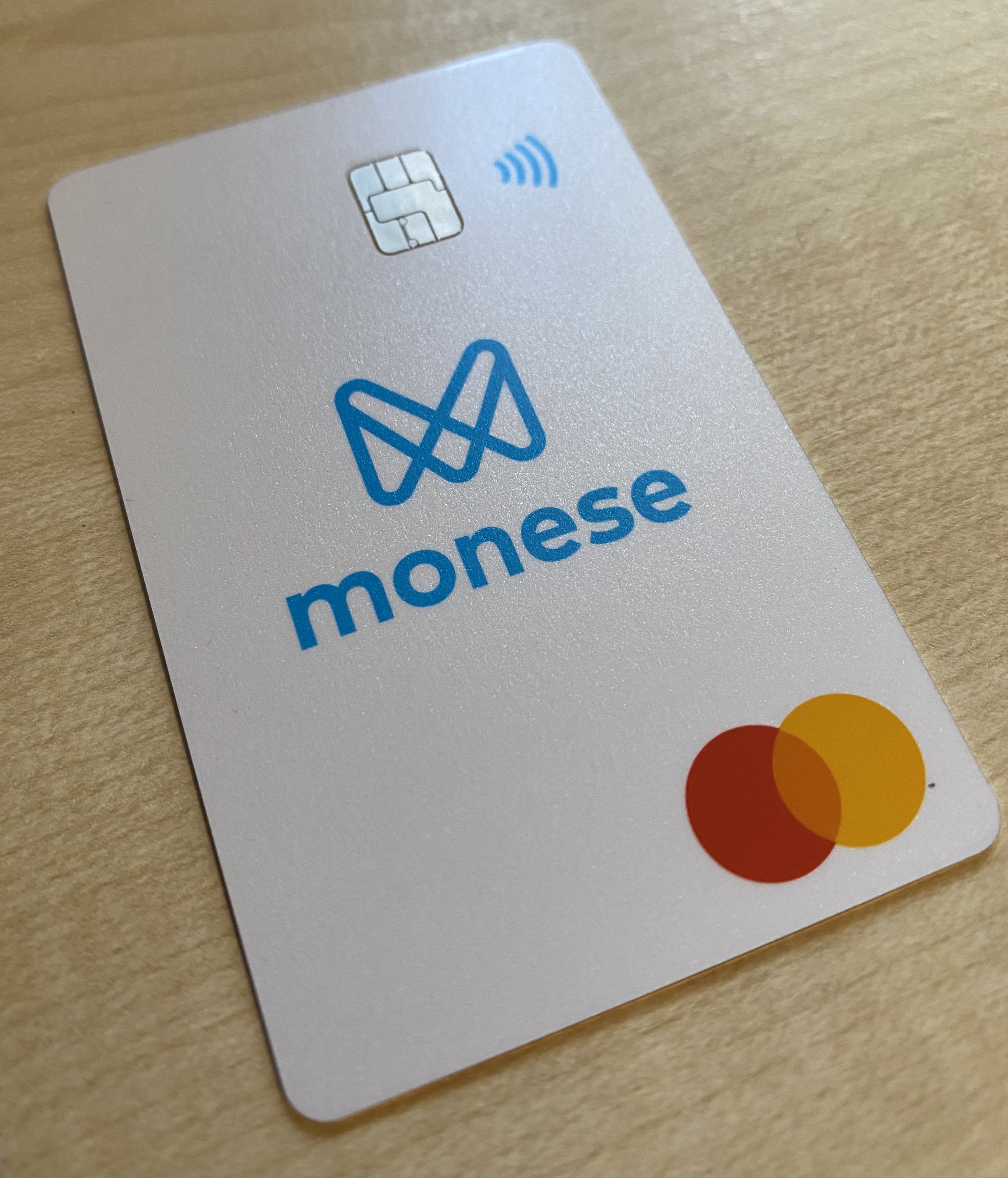
However, there’s a saving grace, and my oh my is it a good one. @anon62610374 behold the beautiful iridescent silver/rainbow core!
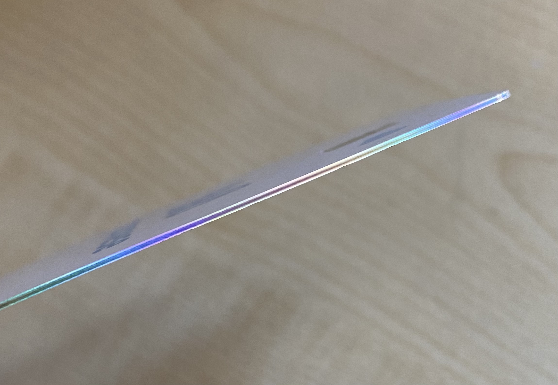
7 Likes
It still has a fairly cheap feel tbh
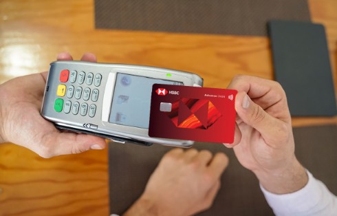
Just seen this posted over on the Monzo forum: HSBC’s new card designs…
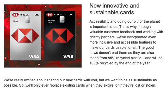
Talk about a step backwards! The HSBC lion design was one of my absolute favourites in the entire market and I thought it was really well unified across their whole global product offering. This new one is so uninspiring and bland - it’s actually one of my least favourite in the UK! If they’d wanted to switch from landscape to portrait, as seems to be the trend with old banks trying to add a bit of modern sparkle (think TSB, Virgin Money…), they could’ve just rotated the lion! It actually looks really good in portrait (see my first post in this thread for the HSBC HK debit card which is portrait and absolutely stunning!).
I wonder how much a branding agency got paid to ‘fix’ a perfectly good, iconic design and replace it with this generic garbage?
5 Likes
I quite like those - they look very fintechy 
I know, it’s awful!
They’ve even added the pointless (and ugly) arrow from the new First Direct debit cards.
What a shame!
2 Likes
some of the mockups make it seem like the logo in the centre is a cut out, or transparent. It won’t be, because HSBC. But would be cool if it was.
2 Likes
I believe that might be an accessibility feature for the visually impaired? I think Barclays offer something similar (but with a bigger arrow), but only on specially-requested high visibility cards - IIRC it’s one of the options when using the ‘design your own card’ service they have.
It would be pretty cool if the HSBC hexagon was made of a transparent red plastic, so you could see through it but also maintain the brand colours. But alas, as you say, legacy banks gonna legacy… ![]()
What really grinds my gears is the (lack of) padding between the bottom of the HSBC UK text and the top of the chip!
5 Likes
It must be for accessibility, because it can’t be for anything else, but it strikes me as unnecessary when the bottom already has a notch anyway.
Surely it would be easier to look for (or even feel for) the notch and then know your card was the right way round rather than look for a white arrow?
It doesn’t make sense to me at all!
The mockups for these new cards (I haven’t seen an actual photo yet) don’t seem to show a notch? Perhaps they see the arrow as an alternative solution?
3 Likes
It seems like a global change in HSBC’s card design.
This is from their Canadian site:
I don’t know HSBC UK would adopt a vertical design though, if they are not doing it other countries.
Will miss the lion though.
2 Likes
That’s obviously just a mock-up, as there is no Visa or Mastercard logo.
I don’t see any reason not to have vertical and standard card types with the same design, especially since they already have different variants for the lion design.
I agree that I’ll miss the lion design though.
I missed that, and for some reason I assumed they had one!
I think the notch is far better, it’s less intrusive in design terms but also works better (even totally blind people would be able to feel for the notch). It’s also getting to the point of being somewhat of a standard feature, so I think it would be a better idea to use it rather than create yet another new standard unnecessarily.
3 Likes
First thing I noticed ![]() That would really bug me
That would really bug me
I agree with everyone else though - the lion was a much better design. I generally dislike the whole approach from HSBC on the branding front. Like the app splash screen with “Welcome” across the HSBC shape.
4 Likes